Keynote, PowerPoint & Qlab Programming
 |  |  |
During the past few years I have provide a lot number of Projections for shows, as well as PowerPoint and Keynote slides for corporate events.
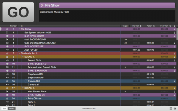
I use Qlab version 3 for Show Projections & Sound Effects and Keynote & Powerpoint for corporate visuals.
For Corporate slides, I find myself repeatedly making the same recommendations, which I have listed below.
Avoiding Death By PowerPoint
Presentation slides serve two primary purposes. One is to support a live presentation in which each slide is annotated verbally. The other is for the content to standalone, allowing a reader to effectively review the slides without the benefit of a speaker’s insights. The relevancy of the following suggestions is dependent on the slide creator’s underlying intentions.
Lead With Team – Establish credibility with your audience at the outset by graphically depicting you (and your team’s) experiences by displaying organizational logos.
What’s Your Story? – Stories have a beginning, a middle, and an end. Your slides should do the same. If you are a startup seeking funding, convey your company’s origins, your current status and your ideal exit.
Present Naked – Slides all too often become a presenter’s crutch. Some of the best entrepreneurial pitches I have witnessed are those that involved no PowerPoint. Instead, the presenters told their story in a conversation manner, rather than via the typical monologue approach.
More Is Less – I recently had lunch with a friend who is a highly successful entertainment industry professional. We were talking about an upcoming conference when he declared, “I hate PowerPoint. I wish people would stop trying to show how powerful they are and just get to the point.”
Have you ever sat through a business presentation and thought at the end, “Wow, I wish the speaker would keep talking.” No one has. Most business talks are way too long. Avoid this common mistake by limiting your presentation to a maximum of a dozen slides, including your Intro and Thank You slides.
Exhibit Slides – Depending on the nature of your talk, there might be areas of discussion that are interesting, but do not fit within your dozen key slides. In order to adequately prepare for such sidebar discussions, place such slides at the back of your deck, after your Thank You slide. Know the order of these slides intimately so that you can quickly access the appropriate one(s), as needed.
Imagery Over Text – Text is boring. Too much of it and a portion of your audience will stop listening and start reading while the remaining folks will tune you out altogether. Keep in mind that images are more than photos; graphs, schematics, tables and charts are excellent ways to draw your listeners into your story.
Slides Are Not Art – Compelling images are important, but ensure that your message is not overcome by design and production elements. Entertaining slides are effective, as long as they do not distract from your story.
Pretend You’re A TEDster – Hundreds of instructive examples of effective PowerPoint and Keynote slides reside online. In particular, TEDTalk speakers make extremely effective use of presentation tools. When viewing a TEDTalk, notice how the speakers time the builds of their slides to accentuate their key points and craft a story that engages their audiences through the beginning, middle and end.
Below is a video Demo of the Keynote Slides I designed for The 2015 AIMS Awards ceremony. It is saved as a Mp4 movie file & I have speed it up in parts to shorten the video.
